
Call Center KPIs: What Operations Leaders Actually Measure
Call Center KPIs: What Operations Leaders Actually Measure
The six metrics that separate high-performing contact centers from the rest are First Contact Resolution, CSAT, Service Level, Average Handle Time, Cost per Contact, and Occupancy/Schedule Adherence. Track those six first. They cover both sides of the performance equation: customer experience and operational efficiency. Everything else on your dashboard is either a diagnostic tool you pull when something breaks or a vanity metric you should retire.
Why this short list? FCR and CSAT tell you whether customers are getting real value from each interaction. Service Level (the industry’s conventional 80/20 standard, meaning 80% of calls answered within 20 seconds) tells you whether you’re staffed correctly. AHT and Cost per Contact tell you what each interaction costs. Occupancy and Adherence tell you whether your workforce management is working. Together, they give executives, supervisors, and agents a shared language for improvement. Forrester’s research on customer service metrics makes the same point: KPIs only earn their place when they connect directly to revenue or retention outcomes, not just reporting cadences.
- First Contact Resolution (FCR): The single strongest predictor of both customer satisfaction and cost efficiency.
- CSAT: Your direct read on whether customers felt the interaction was worth their time.
- Service Level / ASA: The staffing signal. Deviation here means a WFM problem, not an agent problem.
- Average Handle Time (AHT): The efficiency lever, but only meaningful when read alongside FCR and quality scores.
- Cost per Contact: The executive metric that ties every operational decision to the P&L.
- Occupancy / Schedule Adherence: The workforce health check that prevents burnout and understaffing simultaneously.
Key Takeaways
The six core call center KPIs (FCR, CSAT, Service Level, AHT, Cost per Contact, and Occupancy/Adherence) deliver the most operational and CX signal per metric, and every other measure on your dashboard should either explain their movement or be retired.
| Point | Details |
|---|---|
| Start with six core KPIs | FCR, CSAT, Service Level, AHT, Cost per Contact, and Occupancy cover both CX and efficiency. |
| FCR drives the most downstream value | A single FCR improvement reduces volume, cost, and repeat contacts simultaneously. |
| Role-based dashboards outperform universal ones | Executives, supervisors, and WFM analysts each need a different KPI subset to act effectively. |
| Full-population QA is now achievable | AI call scoring eliminates sample bias and surfaces coaching opportunities random sampling misses. |
| Retire metrics that don’t drive decisions | Any KPI that hasn’t changed a decision in 90 days belongs off the dashboard, not on it. |
Table of Contents
- The essential call center KPIs: definitions, formulas, and targets
- How to choose the right KPIs for your role and your operation
- How to measure and track KPIs reliably
- Turning KPIs into operational actions
- A sample KPI dashboard and reporting cadence you can use this week
- Benchmarks, targets, and realistic goal-setting
- Common measurement pitfalls and vanity metrics to drop
- How channel segmentation makes your KPIs more precise
- How KPIs affect employee engagement and the HR metrics worth watching
- KPI-driven improvements: what the evidence actually shows
- Balancing quantitative KPIs with qualitative feedback
- The metrics that matter most are the ones you’ll actually use
- Ready to put these KPIs to work
- Frequently asked questions
- Sources
The essential call center KPIs: definitions, formulas, and targets
Every metric below includes a formula, the unit it’s expressed in, and an illustrative benchmark range. The benchmark ranges reflect common industry guidance; your actual target should be derived from your baseline (more on that in the target-setting section).
| KPI | Formula | Unit | Illustrative Benchmark |
|---|---|---|---|
| First Contact Resolution (FCR) | (Contacts resolved on first attempt ÷ Total contacts) × 100 | % | Typical industry range |
| CSAT | (Satisfied responses ÷ Total survey responses) × 100 | % | Common industry range |
| Net Promoter Score (NPS) | % Promoters − % Detractors | Score (−100 to +100) | Moderate positive values |
| Customer Effort Score (CES) | Average rating on effort scale (1–7 or 1–5) | Score | Mid-range values on scale |
| Service Level | (Calls answered within threshold ÷ Total calls offered) × 100 | % | Standard industry target |
| Average Speed of Answer (ASA) | Total wait time ÷ Total calls answered | Seconds | Expected to be kept low |
| Abandonment Rate | (Abandoned calls ÷ Total calls offered) × 100 | % | Expected to be minimized |
| Average Handle Time (AHT) | Talk time + Hold time + After-Call Work (ACW) | Seconds/minutes | Varies significantly by vertical |
| After-Call Work (ACW) | Total ACW time ÷ Total contacts handled | Seconds | Expected to be kept low |
| Occupancy | (Handle time ÷ Available time) × 100 | % | Common target range |
| Schedule Adherence | (Time in adherence ÷ Scheduled time) × 100 | % | Common target range |
| Transfer Rate | (Transferred contacts ÷ Total contacts) × 100 | % | Expected to be minimized |
| Repeat Contact Rate | (Contacts from customers who called before ÷ Total contacts) × 100 | % | Expected to be minimized |
| Cost per Contact | Total operational cost ÷ Total contacts handled | $ per contact | Varies widely by channel |
| IVR Containment Rate | (Contacts resolved in IVR ÷ Total IVR contacts) × 100 | % | Commonly varies |
| Call Volume | Total contacts received in a period | Count | Depends on operation size |
First Contact Resolution
FCR measures whether a customer’s issue was fully resolved without a follow-up call, email, or repeat contact. It’s the most operationally powerful metric on this list because a one-point FCR improvement typically reduces inbound volume, cuts cost per contact, and lifts CSAT simultaneously. The formula is straightforward: divide contacts resolved on the first attempt by total contacts, then multiply by 100. The tricky part is defining “resolved” consistently across your team. Measure it via post-call surveys, CRM case closure flags, or repeat-contact analysis within a 7-day window.
CSAT and NPS
CSAT captures satisfaction with a specific interaction; NPS captures overall brand loyalty. Both matter, but they answer different questions. CSAT is transactional and immediate. NPS is relational and lagging. For day-to-day coaching, CSAT is more useful. For executive reporting, NPS shows whether your service operation is building or eroding the customer relationship over time. The ACSI’s national CSAT benchmarks give you an external reference point when setting realistic targets by sector.
Customer Effort Score
CES asks customers how easy it was to resolve their issue, typically on a 7-point scale. Gartner’s research on CES positions it as a stronger predictor of repeat behavior than satisfaction alone. A customer can be satisfied with a resolution and still find the process exhausting enough to switch providers. Pair CES with transactional CSAT for a complete CX picture.
Service Level and ASA
Service Level and ASA are two views of the same problem: queue management. Service Level tells you the percentage of calls answered within a defined threshold (the 80/20 convention is the most widely cited standard). ASA gives you the average wait across all answered calls. Use Service Level for real-time staffing decisions and ASA for trend analysis. A rising ASA with a stable Service Level usually means your threshold is too generous.
Abandonment Rate
When callers hang up before reaching an agent, that’s an abandoned call. High abandonment correlates directly with poor Service Level and long ASA. The formula: divide abandoned calls by total calls offered, then multiply by 100. Calls abandoned in the first few seconds (often before the IVR even completes) are typically excluded from the denominator to avoid distorting the metric.
AHT and ACW
AHT is the sum of talk time, hold time, and after-call work. It’s the efficiency metric most supervisors watch most closely, and it’s also the one most frequently misused. Chasing a lower AHT without monitoring FCR and quality scores almost always backfires: agents rush, resolution drops, and repeat contacts rise. ACW is worth tracking separately because bloated ACW often signals a CRM usability problem or inadequate training, not an agent performance issue.
Occupancy and Schedule Adherence
Occupancy measures the percentage of available time agents spend handling contacts. Above 85–90%, agents burn out and quality degrades. Schedule Adherence measures whether agents are logged in and available when their schedule says they should be. These two metrics together give your WFM team the signal they need to adjust staffing before a service level crisis develops.
Transfer Rate and Repeat Contact Rate
Transfer Rate flags routing problems. A high transfer rate means customers are landing in the wrong queue or agents lack the skills or authority to resolve issues. Repeat Contact Rate is a proxy for FCR when you can’t measure FCR directly. If the same customer calls back within 7 days, the first contact almost certainly didn’t resolve the issue.
Cost per Contact
Divide total operational costs (labor, technology, overhead) by total contacts handled. This is the metric that connects every operational decision to the P&L. Reducing AHT by 30 seconds across 50,000 monthly contacts has a calculable dollar value. So does a 5-point FCR improvement that deflects repeat calls. Cost per Contact makes those calculations possible.
Vanity metrics warning: Metrics like total calls handled, average speed of answer in isolation, and calls per agent per day can look impressive on a report and tell you almost nothing about whether your operation is actually improving. ProductPlan’s definition of vanity metrics captures the core problem: a metric that goes up without telling you what to do differently is a distraction, not a signal.
How to choose the right KPIs for your role and your operation
Not every metric belongs on every dashboard. The right KPI set depends on your role, your business goals, and what data you can actually measure reliably.
A simple selection framework
Start with your business goal. Cost reduction, customer retention, compliance, and revenue growth each point to a different primary metric. Then ask whether you can measure it accurately with the systems you have today. A KPI you can’t measure cleanly is worse than no KPI at all because it creates false confidence.
- Identify your top business priority (cost, retention, compliance, revenue).
- Map one or two primary KPIs directly to that priority.
- Add two or three diagnostic KPIs that explain why the primary metric moves.
- Confirm data availability for each metric before adding it to a dashboard.
- Set a review date to drop any metric that hasn’t driven a decision in 90 days.
Role-based KPI shortlists
Executive / VP of Operations: FCR, CSAT, NPS, Cost per Contact, Service Level. These five give a complete picture of whether the operation is delivering value at a sustainable cost.
Operations Director / Contact Center Manager: All six core metrics plus Abandonment Rate, Transfer Rate, and Repeat Contact Rate. This set supports both daily operational decisions and weekly trend analysis.
Frontline Supervisor: AHT, ACW, CSAT (agent-level), Schedule Adherence, and FCR (agent-level). Supervisors need metrics they can act on in a coaching conversation, not macro trends.
QA Lead: CSAT, CES, Transfer Rate, and a quality score derived from call evaluations. QA’s job is to explain the “why” behind the numbers, so qualitative scoring matters as much as the quantitative metrics.
Workforce Management: Service Level, ASA, Abandonment Rate, Occupancy, and Schedule Adherence. WFM lives and dies by queue health and staffing accuracy.
How to prune a bloated dashboard
- Remove any metric no one has cited in a decision in the past quarter. If it’s on the dashboard but not in any meeting, it’s decoration.
- Consolidate overlapping metrics. If you’re tracking both ASA and Service Level, pick the one your team actually uses for staffing decisions.
- Flag metrics with inconsistent definitions across tools. A metric calculated differently in your ACD and your CRM is not one metric; it’s two conflicting numbers.
- Drop any metric that moves in the right direction when you do the wrong thing. Calls per agent per day goes up when agents rush. That’s not a win.
How to measure and track KPIs reliably
Getting the right number is harder than choosing the right metric. Here’s where each KPI should come from and how often to calculate it.
| KPI | Primary Source System | Recommended Cadence |
|---|---|---|
| FCR | Post-call survey + CRM repeat-contact analysis | Daily (agent), weekly (team) |
| CSAT / CES | Post-interaction survey platform | Daily (agent), weekly (team) |
| NPS | Relationship survey platform | Monthly or quarterly |
| Service Level / ASA | ACD / telephony platform | Real-time + hourly |
| Abandonment Rate | ACD / telephony platform | Real-time + hourly |
| AHT / ACW | ACD + CRM (call disposition) | Daily |
| Occupancy | WFM platform | Real-time + daily |
| Schedule Adherence | WFM platform | Real-time + daily |
| Transfer Rate | ACD / CTI routing logs | Daily |
| Repeat Contact Rate | CRM (contact history, 7-day window) | Weekly |
| Cost per Contact | Finance + ACD (volume) | Monthly |
| IVR Containment Rate | IVR / self-service platform logs | Daily |
Sampling vs. full-population measurement
For queue metrics (Service Level, AHT, Abandonment), always use full-population data. Sampling introduces noise that makes trend analysis unreliable. For QA-based metrics (quality scores, compliance adherence), traditional human QA uses a sample of 2–5% of contacts per agent per month. AI-enabled QA can score 100% of contacts, which eliminates sample bias entirely and surfaces coaching opportunities that random sampling misses.
Common data-quality pitfalls
- Time zone mismatches in multi-site or remote operations cause ACD and CRM timestamps to misalign, distorting AHT and repeat-contact calculations.
- Truncated call logs occur when calls are transferred or conferenced and the ACD records only the first leg. The result is an artificially low AHT.
- Inconsistent ACW tagging happens when agents close ACW before finishing wrap-up work. The ACD records a short ACW; the actual work continues off the clock.
- Survey response bias in CSAT and NPS: customers who respond to post-call surveys skew toward the extremes. Weight your survey data accordingly and track response rates alongside scores.
Pro Tip: Build your ETL pipeline to preserve raw call-leg data before aggregation. Aggregated ACD exports often drop transfer legs and conference segments. Keeping raw leg-level records lets you reconstruct true handle time and identify routing anomalies that aggregated reports hide entirely.
Turning KPIs into operational actions
A KPI that doesn’t change behavior is just a number on a screen. Here’s how to connect metric deviations to specific operational responses.
The deviation-to-action workflow
When a KPI moves outside its control band, the response should be systematic, not reactive.
- Identify the deviation and its direction (rising, falling, spiking).
- Pull the diagnostic metrics that explain the primary metric’s movement.
- Segment by agent, queue, and time of day to isolate the source.
- Assign ownership to the supervisor, QA lead, or WFM analyst most relevant to the root cause.
- Execute a corrective action from a predefined playbook (coaching, routing change, knowledge base update, schedule adjustment).
- Set a review checkpoint within 5–10 business days to confirm the action worked.
Specific KPI-to-action examples
Rising AHT + falling FCR: This combination almost always points to a knowledge gap or a broken process. Agents are spending more time on calls but still not resolving issues. Pull call recordings for the affected queue, identify the most common unresolved issue type, and check whether the knowledge base or CRM workflow covers it. A targeted coaching session or a knowledge base update typically moves both metrics within two weeks.
High Transfer Rate in a specific queue: Routing is sending contacts to the wrong skill group, or agents in that queue lack the authority to resolve the issue. Check the IVR routing logic first. If routing is correct, the fix is either agent training or an escalation policy change.
CSAT dropping while AHT holds steady: Quality is degrading without a handle-time signal. This is a tone, empathy, or resolution-quality problem, not an efficiency problem. Pull QA scores for the same period. If QA scores are also dropping, it’s a coaching issue. If QA scores are stable, your QA rubric may not be capturing what customers actually care about.
WFM should immediately check for schedule adherence issues, unplanned absences, and whether volume forecasts were accurate. Overtime authorization or temporary queue consolidation may be needed.
Incorporating KPIs into coaching scorecards
A coaching scorecard that combines quantitative KPIs (AHT, CSAT, FCR) with QA evaluation scores gives supervisors a complete picture of agent performance. The quantitative metrics show what happened; the QA scores explain why. Structure the scorecard so that no single metric can dominate the overall rating. An agent with a low AHT but a poor FCR rate and low CSAT scores is not a high performer.
For teams using Revring’s predictive dialer, occupancy and calls-per-hour data feed directly into the coaching scorecard, giving supervisors a real-time view of dialing efficiency alongside quality metrics.
Pro Tip: *Use AI call scoring to pre-flag calls for human QA review rather than selecting calls randomly.
A sample KPI dashboard and reporting cadence you can use this week
A well-designed dashboard has three layers: executive visibility at the top, operational trending in the middle, and agent-level coaching signals at the bottom.
Dashboard layout
Top row (executive KPIs): FCR (monthly trend), CSAT (weekly trend), NPS (quarterly), Cost per Contact (monthly), Service Level (daily average). These five widgets give leadership a complete health check in under 60 seconds.
Middle row (operational trending): Service Level and Abandonment Rate (real-time + 7-day trend), AHT by queue (daily), Occupancy by team (daily), Repeat Contact Rate (weekly). This row is where operations managers spend most of their time. Trend lines matter more than point-in-time values here.
Bottom row (agent coaching signals): AHT (agent-level, daily), CSAT (agent-level, weekly), Schedule Adherence (daily), ACW (agent-level, daily), QA score (weekly). Supervisors use this row to prepare for coaching conversations and to identify agents who need immediate support.
Reporting cadence
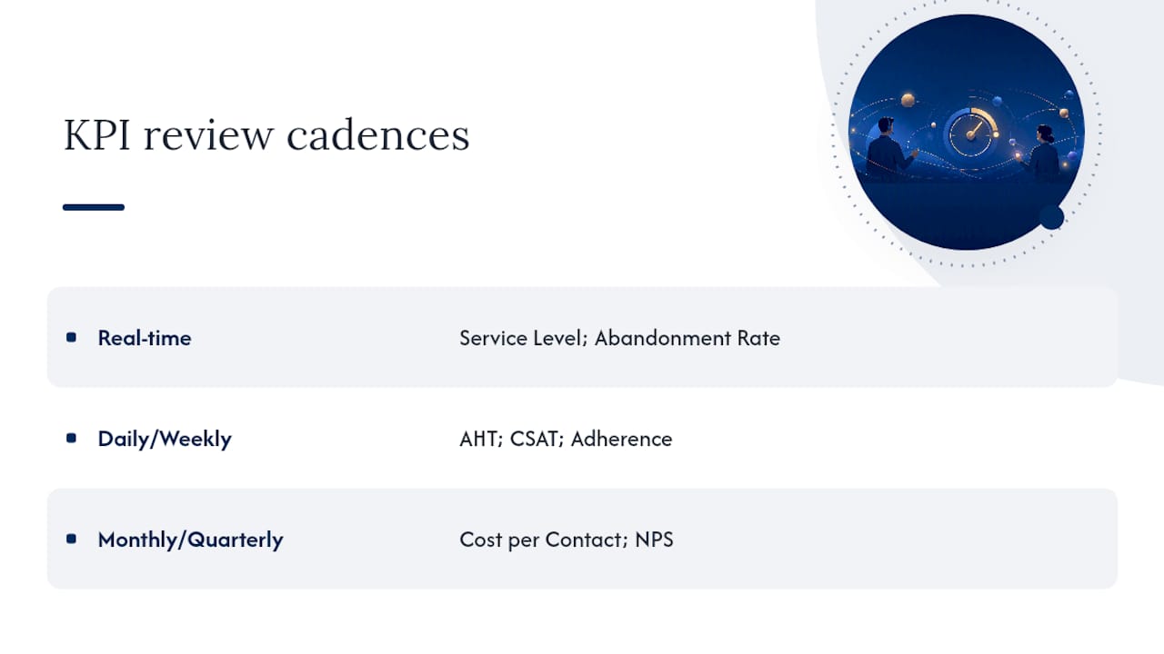
- Real-time alerts: Service Level below threshold, Abandonment Rate above 8%, Occupancy above 90%. These go to the supervisor on duty and the WFM analyst immediately.
- Daily supervisor digest: AHT, ACW, CSAT, Adherence, and queue-level Service Level summary. Delivered each morning for the prior day.
- Weekly operations report: FCR trend, Repeat Contact Rate, Transfer Rate, CSAT trend, and a top-5 agent coaching list. Distributed to operations managers and QA leads.
- Monthly executive scorecard: FCR, CSAT, NPS, Cost per Contact, Service Level monthly average, and headcount efficiency. Presented to leadership with a written narrative.
Revring’s reporting infrastructure connects telephony data, CRM records, and AI scoring outputs into a single reporting layer, which eliminates the manual data-joining that makes most dashboard builds slow and error-prone.
Dashboard insight: The most common dashboard failure isn’t missing data. It’s too much data with no clear decision hierarchy. Every widget on your dashboard should answer a specific question for a specific role. If you can’t name the question and the role, remove the widget.
Pro Tip: Build two versions of every dashboard: a full desktop view for deep analysis and a mobile-optimized summary with the top five KPIs only. Supervisors checking metrics between coaching sessions need a 5-second read, not a 50-widget spreadsheet. Most BI tools support responsive layouts or separate mobile views with minimal additional configuration.
Benchmarks, targets, and realistic goal-setting
Setting a target by copying an industry benchmark is the fastest way to set a target no one believes in. Here’s a method that produces goals your team will actually pursue.
A four-step target-setting method
- Measure your baseline for at least 30 days before setting any target. You need to know where you actually are, not where you think you are.
- Compare to an external benchmark to understand the gap. ACSI’s sector-level CSAT data and industry guides give you a credible reference range.
- Calculate the ROI of closing the gap before committing to a target. A 5-point FCR improvement at 50,000 monthly contacts, assuming a 15% repeat-contact rate, deflects roughly 3,750 contacts per month. At an average cost of $8 per contact, that’s $30,000 in monthly savings. That calculation tells you how much to invest in the improvement.
- Set phased goals rather than a single end-state target. A 3-point FCR improvement in 90 days, followed by another 3 points in the next 90 days, is more achievable and more motivating than a single 6-point annual target.
Conservative vs. aggressive targets
Use conservative targets when your measurement infrastructure is new or when your baseline data is less than 60 days old. Aggressive targets are appropriate when you have a clear root cause identified, a specific intervention planned, and historical data showing the intervention has worked before. Setting an aggressive target without a clear action plan is how teams end up gaming metrics rather than improving them.
Statistic callout: Industry KPI guides consistently group contact center metrics into four tiers: core efficiency, customer experience, agent performance, and business impact. Teams that organize their targets by tier, rather than tracking all metrics at the same priority level, report cleaner governance and faster decision cycles.
Common measurement pitfalls and vanity metrics to drop
The most dangerous metrics aren’t the ones you’re ignoring. They’re the ones you’re watching closely but misinterpreting.
The most common pitfalls
- Optimizing AHT in isolation. Reducing average handle time without monitoring FCR and CSAT simultaneously almost always produces shorter calls with worse outcomes. The metric improves; the operation degrades.
- Treating survey response rate as a proxy for satisfaction. A 40% survey response rate with a high CSAT score tells you that satisfied customers responded. It tells you nothing about the 60% who didn’t.
- Using different formulas for the same KPI across systems. If your ACD calculates AHT including hold time and your CRM calculates it excluding hold time, you have two different metrics with the same name. Standardize formulas in writing before building any dashboard.
- QA sample bias. Selecting calls for quality review based on supervisor familiarity or agent seniority rather than random or AI-flagged selection produces a sample that doesn’t represent actual performance. The result is a quality score that reflects who got reviewed, not how well the team performed.
- Tracking call volume as a success metric. High call volume can mean high demand, poor self-service, or a product problem generating complaints. The number alone tells you nothing.
Specific remedies
- Pair every efficiency metric (AHT, calls per hour, ACW) with at least one quality or outcome metric (FCR, CSAT, QA score) on the same dashboard row. Never display them in separate reports.
- Add a quality check to your CSAT reporting: if CSAT is rising but QA scores are flat, investigate whether your survey questions are actually measuring what customers care about.
- Document your KPI formulas in a shared glossary accessible to every system administrator and analyst. Revise it every time a new tool is added to the stack.
Pro Tip: Run a quarterly metric audit. Pull every metric on every dashboard and ask one question: “What decision did this metric drive in the last 90 days?” If no one can answer, retire the metric. A dashboard with 8 metrics everyone uses beats a dashboard with 30 metrics no one trusts.
How channel segmentation makes your KPIs more precise
A single AHT figure for your entire operation is almost meaningless. A phone call, a live chat session, and an email response have fundamentally different handle-time profiles, resolution rates, and cost structures. Treating them as one number hides the signal.
Phone
Phone remains the highest-cost, highest-complexity channel for most operations. FCR, AHT, and CSAT are all meaningful here. Abandonment Rate and Service Level are phone-specific metrics because they depend on real-time queue dynamics that don’t apply to asynchronous channels.
Live chat
Chat handle time is typically lower than phone, but agents often handle multiple concurrent sessions, which changes the occupancy calculation. Occupancy for chat should account for concurrent session capacity, not just time-in-contact. FCR for chat is harder to measure because customers may close a chat window and return later without it registering as a repeat contact in your ACD. Use CRM case data to track chat resolution more accurately.
Email and async messaging
Resolution time replaces handle time as the primary efficiency metric for email. First Response Time (the time from receipt to first agent reply) and Full Resolution Time (time from receipt to case closure) are the relevant measures. CSAT surveys sent after email resolution tend to have lower response rates than post-call surveys, so weight email CSAT data carefully.
Social and messaging apps
Social contacts often involve public visibility, which adds a reputational dimension that phone and email don’t carry. Response time matters more here than in any other channel because slow responses are visible to other customers. Track First Response Time and Resolution Rate for social, and add a sentiment score where your platform supports it.
Microsoft’s research on digital channel growth confirms that AI-enabled measurement now makes channel-specific sentiment scoring and full-population QA practical across all channels, not just phone. Teams using platforms with AI automation capabilities can apply consistent scoring rubrics across phone, chat, and email simultaneously.
How KPIs affect employee engagement and the HR metrics worth watching
The connection between KPI design and agent turnover is direct and underappreciated. Contact center agent turnover rates are among the highest of any industry. A significant portion of that turnover is driven by how performance is measured, not just by compensation or working conditions.
The KPI-engagement connection
Agents who are measured primarily on efficiency metrics (AHT, calls per hour) with little weight on quality or customer outcomes report lower job satisfaction and higher burnout rates. The reason is straightforward: efficiency targets create pressure to rush, rushing produces poor outcomes, poor outcomes generate customer complaints, and customer complaints land back on the agent. The feedback loop is demoralizing.
Balanced scorecards that weight quality and FCR alongside efficiency give agents a sense of control over their performance. When an agent can improve their score by resolving issues more thoroughly rather than just faster, the job becomes more sustainable.
HR metrics worth adding to your operations dashboard
- Agent Attrition Rate: (Agents who left ÷ Average agent headcount) × 100. Track monthly. Rising attrition is often the first signal that KPI targets are unrealistic or that coaching quality has dropped.
- Absenteeism Rate: Unplanned absences as a percentage of scheduled hours. High absenteeism correlates with burnout, which correlates with occupancy targets that are consistently too high.
- Time to Proficiency: The number of days from hire to the point where a new agent hits baseline performance targets. Longer time-to-proficiency signals onboarding or training gaps that also show up in FCR and CSAT for new agents.
- Internal Promotion Rate: The percentage of supervisors and leads promoted from the agent pool. A low rate signals that agents don’t see a career path, which accelerates voluntary turnover.
Schedule Adherence, when tracked transparently and used constructively rather than punitively, also functions as an early warning system for engagement problems. An agent whose adherence drops suddenly without an obvious operational cause is often dealing with a motivation or personal issue that a proactive conversation can address before it becomes a resignation.
KPI-driven improvements: what the evidence actually shows
The most credible evidence for KPI-driven improvement comes from operations that changed one variable at a time and measured the result.
FCR improvement through knowledge base investment
A common pattern in contact center improvement programs: teams that identify their top 10 unresolved issue types, build or update knowledge base articles for each, and then track FCR for those specific issue types over 60 days consistently see FCR improvements in the 5–10 point range for the targeted issues. The mechanism is simple. Agents who can find accurate information quickly resolve issues on the first contact. The knowledge base investment is small relative to the volume reduction it produces.
AHT reduction through CRM workflow redesign
When agents spend significant ACW time manually entering data that the CRM could capture automatically during the call, ACW reduction is a workflow problem, not a training problem. Teams that redesign CRM screen flows to auto-populate fields from the ACD (caller ID, queue, call duration) and reduce required manual entry fields typically see ACW drop by 20–40 seconds per contact. At high contact volumes, that reduction has a meaningful cost-per-contact impact.
Scaling outreach without scaling headcount
The Revring real estate team case study illustrates what happens when dialing efficiency KPIs are connected to the right technology. The KPI that matters most in that scenario isn’t calls per hour in isolation; it’s the ratio of productive contact time to total available time, measured against quality scores to confirm that speed isn’t degrading outcomes.
For operations in insurance, real estate, and healthcare, Revring’s industry-tailored workflows connect dialing efficiency, compliance tracking, and CRM data in a single platform, which means the KPIs that matter for those verticals are measurable from day one rather than requiring custom integration work.
Balancing quantitative KPIs with qualitative feedback
Numbers tell you what happened. Qualitative feedback tells you why, and often points to fixes that no metric would have surfaced on its own.
Where quantitative KPIs fall short
It doesn’t tell you whether they were frustrated by wait time, confused by the agent’s explanation, or upset about a policy they couldn’t change. It doesn’t tell you whether the problem is routing logic, agent training, or a product complexity issue that no amount of training will fix.
Quantitative KPIs are excellent at detecting that something is wrong. They’re poor at explaining what to do about it.
Practical ways to integrate qualitative data
Post-call verbatim comments from CSAT surveys are the fastest source of qualitative signal. Most survey platforms capture open-text responses alongside numeric scores. Reviewing the verbatim comments for your lowest-scoring contacts each week takes 30 minutes and typically surfaces two or three specific, fixable issues that the score alone would never reveal.
Call recording review with a structured evaluation rubric gives QA leads a consistent framework for qualitative assessment. The rubric should include both compliance-based criteria (required disclosures, accurate information) and experience-based criteria (empathy, clarity, resolution confidence). The combination produces a quality score that reflects both what agents said and how they said it.
Agent feedback loops are underused in most operations. Agents who handle hundreds of contacts per week have direct knowledge of the issues customers raise most frequently, the knowledge base gaps that slow resolution, and the policy constraints that frustrate customers. A structured monthly feedback session with frontline agents, tied explicitly to KPI trends, often produces better root-cause hypotheses than any amount of data analysis.
Pairing call time optimization practices with qualitative review cycles gives operations managers both the efficiency signal and the explanatory context needed to make changes that actually stick.
The metrics that matter most are the ones you’ll actually use
Most contact center dashboards have too many metrics and too few decisions. The conventional advice, which is to track every KPI available in your platform, produces operations teams that spend more time explaining numbers than changing them.
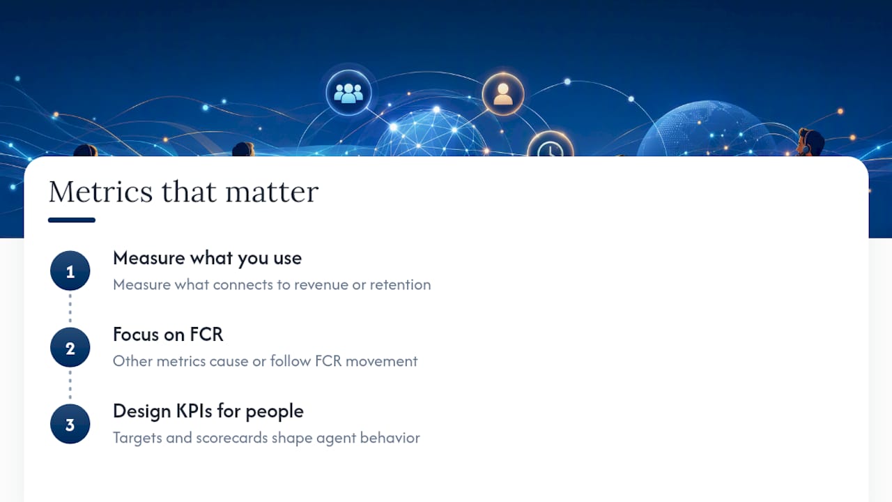
The research behind this guide points to a different conclusion. Forrester’s framework for customer service metrics is explicit: measure what connects to revenue or retention, and retire everything else. That’s not a minimalist philosophy. It’s an operational discipline. A team that tracks six metrics with precision and acts on every deviation will outperform a team tracking thirty metrics with no clear ownership of any of them.
The second thing the evidence supports is the primacy of FCR. Every other metric on this list is either a cause of FCR movement or a consequence of it. AHT, Transfer Rate, Repeat Contact Rate, and Cost per Contact all move when FCR moves. CSAT and NPS follow FCR with a short lag. If you could only improve one metric, FCR is the one. The operational and financial returns are larger, faster, and more durable than any other single improvement.
The third point is one most guides understate: KPI design is a people decision as much as a measurement decision. The metrics you choose to display, the targets you set, and the way you use them in coaching conversations shape agent behavior directly. Efficiency-only scorecards produce efficiency-only behavior. Balanced scorecards that weight quality and resolution alongside speed produce agents who are both efficient and effective. The measurement system you build is, in practice, the performance culture you create.
Ready to put these KPIs to work
If your current platform requires manual data joins to calculate FCR, Cost per Contact, or agent-level CSAT, you’re spending analyst time on plumbing that should be automatic. Revring’s integrated platform connects your predictive dialer, CRM, AI call scoring, and workforce management data into a single reporting layer, so the KPIs in this guide are available without custom integration work.
For teams in insurance, real estate, healthcare, and legal, Revring’s industry-tailored playbooks mean your KPI targets and workflows are pre-configured for your vertical’s compliance and performance standards. Explore Revring’s pricing and plans to see which configuration fits your operation’s scale.
Frequently asked questions
What are the most important call center KPIs to track? FCR, CSAT, Service Level, AHT, Cost per Contact, and Occupancy/Schedule Adherence are the six that cover both operational efficiency and customer experience. Start there before adding any others.
How is First Contact Resolution calculated? Divide the number of contacts resolved on the first attempt by the total number of contacts handled, then multiply by 100. The key variable is how you define “resolved,” which should be consistent across your team and documented in your KPI glossary.
What is a good CSAT score for a contact center? The ACSI publishes sector-level benchmarks that give you a more precise external reference for your specific industry.
How often should KPIs be reviewed? Queue metrics like Service Level and Abandonment Rate need real-time monitoring. AHT, CSAT, and Adherence are best reviewed daily at the agent level and weekly at the team level. Cost per Contact and NPS are monthly or quarterly metrics.
What is the difference between a KPI and a vanity metric? A KPI drives a specific decision when it moves outside its target range. A vanity metric looks good on a report but doesn’t tell you what to do differently. Total calls handled and average speed of answer in isolation are common examples of vanity metrics in contact center reporting.
How do you set realistic KPI targets? Measure your baseline for at least 30 days, compare it to an external benchmark, calculate the ROI of closing the gap, and set phased improvement goals rather than a single end-state target. Targets set without a baseline almost always miss.
How should KPIs differ by channel? Phone uses queue-based metrics like Service Level and Abandonment Rate. Chat requires occupancy calculations that account for concurrent sessions. Email and async channels use First Response Time and Full Resolution Time instead of AHT. Social adds a reputational dimension where response speed is the primary metric.
Sources
Your ACD (Automatic Call Distributor) or CTI system is the authoritative source for queue metrics: Service Level, ASA, Abandonment Rate, AHT, and call volume. Your CRM holds the context data that makes those queue metrics meaningful: case outcomes, repeat contacts, and disposition codes that feed FCR calculations. Your WFM platform owns Occupancy and Adherence. Post-call survey platforms own CSAT, NPS, and CES. QA scoring tools own quality scores and, increasingly, AI sentiment data.
Microsoft’s global customer service research highlights how AI and digital channels are changing what’s measurable. Full-population QA, where every call is scored by an AI engine rather than a 2–5% human sample, is now a realistic option for teams using platforms with AI call scoring capabilities. That shift changes the statistical reliability of quality-based KPIs significantly.
- Implement effective customer service metrics (Forrester)
- ACSI press release: national results (Q4 2024)